
Backlink
Om komponenten
Backlink lar brukeren navigere tilbake til forrige sted i en løsning eller et nettsted.
Egnet til:
- Produkter eller sider med kun to nivåer
- Bruk på mindre flater, som på mobil
Uegnet til:
- Produkter eller sider med flere nivåer i navigeringen.
- Ved flere nivåer i navigasjonshierarkiet bør du bruke Breadcrumbs
Relaterte komponenter

Varianter
<>
  <Backlink href="#back">
    Tilbake
  </Backlink>

  <Backlink>
    Tilbake
  </Backlink>
</>
Retningslinjer
Plassering
Backlink plasseres øverst til venstre på siden, under overskriften og navigasjonen, men over sidetittelen. Den skal benytte samme posisjon som Breadcrumbs.
Innhold
Du kan selv velge om backlinken skal innholde navnet på den forrige siden, eller at det står "Tilbake".
Formatering
Anatomi
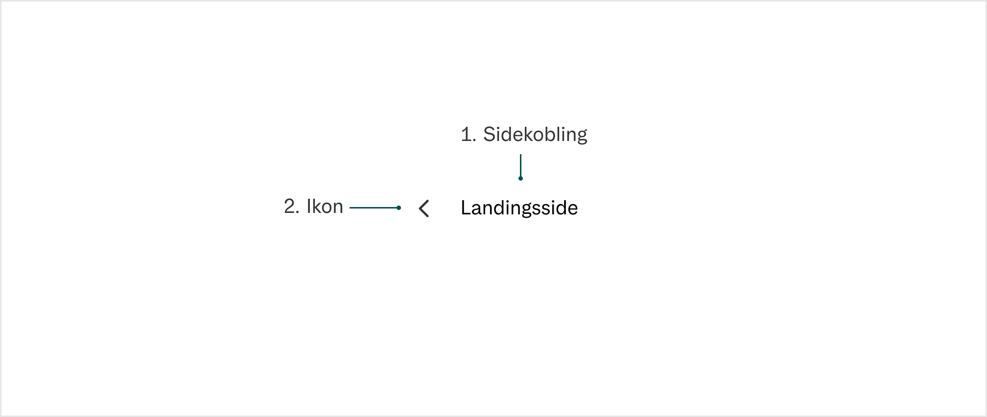
- Sidekobling:
Enten ha "tilbake" eller forrige sides navn - Ikon:
Skal alltid være en pil til venstre for å indikere tilbake til forrige side
Universell utforming
Husk på
- Backlinken må alltid være tilgjengelig med skjermleser og tastaturnavigering
- Lenketeksten skal være tydelig og formidler målet for lenken
Sjekkliste
✓ Vi har testet at lenketeksten tydelig formidler målet for lenken.
✓ Vi har testet at backlink er tilgjengelig med skjermleser og tastaturnavigering.
Les mer
Interaksjon
Tastatur
| Key | Interaksjon |
|---|---|
| Tab | Kunne fokusere komponenten |
| Enter | Kunne trykke på lenken |
Props
Backlink
| Prop | Description | Default |
|---|---|---|
isPending? | - | |
form? | - | |
autoFocus? | - | |
isDisabled? | - | |
type? | 'button' | |
preventFocusOnPress? | - | |
formAction? | - | |
formEncType? | - | |
formMethod? | - | |
formNoValidate? | - | |
formTarget? | - | |
name? | - | |
value? | - | |
excludeFromTabOrder? | - | |
children? | - | |
render? | - | |
href? | Determines whether to use an anchor or a button for the Backlink A URL to link to. See MDN. | - |
withUnderline? | To add a permanent underline on the link (not only on hover) | false |
target? | - | |
| Events | ||
onFocus? | Handler that is called when the element receives focus. | - |
onBlur? | Handler that is called when the element loses focus. | - |
onKeyDown? | Handler that is called when a key is pressed. | - |
onKeyUp? | Handler that is called when a key is released. | - |
onClick? | Not recommended – use onPress instead. onClick is an alias for onPress
provided for compatibility with other libraries. onPress provides
additional event details for non-mouse interactions. | - |
onPress? | Handler that is called when the press is released over the target. | - |
onPressStart? | Handler that is called when a press interaction starts. | - |
onPressEnd? | Handler that is called when a press interaction ends, either over the target or when the pointer leaves the target. | - |
onPressChange? | Handler that is called when the press state changes. | - |
onPressUp? | Handler that is called when a press is released over the target, regardless of whether it started on the target or not. | - |
onFocusChange? | Handler that is called when the element's focus status changes. | - |
onHoverStart? | Handler that is called when a hover interaction starts. | - |
onHoverEnd? | Handler that is called when a hover interaction ends. | - |
onHoverChange? | Handler that is called when the hover state changes. | - |
| Links | ||
referrerPolicy? | - | |
rel? | - | |
hrefLang? | - | |
download? | - | |
ping? | - | |
routerOptions? | - | |
| Styles | ||
className? | 'react-aria-Button' 'react-aria-Link' | |
style? | - | |
| Accessibility | ||
id? | - | |
aria-controls? | - | |
aria-current? | - | |
aria-describedby? | - | |
aria-details? | - | |
aria-disabled? | - | |
aria-expanded? | - | |
aria-haspopup? | - | |
aria-label? | - | |
aria-labelledby? | - | |
aria-pressed? | - | |