Select

Om komponenten

Select viser brukeren en nedtrekksliste der ett alternativ kan velges.

Egnet til:

  • Skjemaer hvor bruker skal velge ett alternativ fra en liste
  • Når siden for det meste er skjemabasert.

Uegnet til:

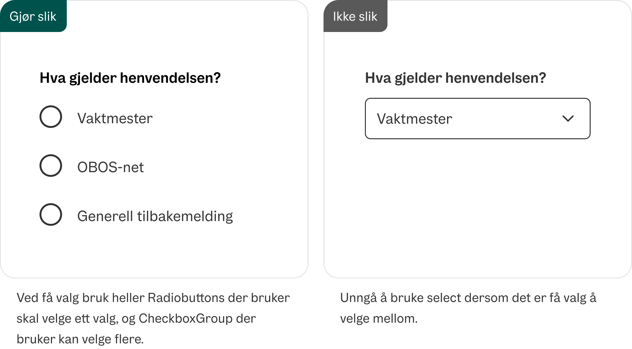
  • Når bruker har få alternativer å velge mellom. Bruk da heller RadioGroup
  • Når bruker kan velge flere alternativer i listen. Da bruker du heller CheckBox

Relaterte komponenter

Divider

Eksempler

En uncontrolled Select

<Select
  label="Velg boligprosjekt"
  placeholder="Velg boligprosjekt"
>
  <SelectItem className="flex gap-2">
    Oslo
    <small className="text-gray">
      Oslo
    </small>
  </SelectItem>
  <SelectItem className="flex gap-2">
    Frogn
    <small className="text-gray">
      Akershus
    </small>
  </SelectItem>
  <SelectItem className="flex gap-2">
    Tønsberg
    <small className="text-gray">
      Vestfold og Telemark
    </small>
  </SelectItem>
</Select>

En påkrevd Select

<form
  onSubmit={(e) => e.preventDefault()}
  className="grid gap-6"
>
  <Select
    label="Velg boligprosjekt"
    placeholder="Velg boligprosjekt"
    isRequired
  >
    <SelectItem className="flex gap-2">
      Oslo
      <small className="text-gray">
        Oslo
      </small>
    </SelectItem>
    <SelectItem className="flex gap-2">
      Frogn
      <small className="text-gray">
        Akershus
      </small>
    </SelectItem>
    <SelectItem className="flex gap-2">
      Tønsberg
      <small className="text-gray">
        Vestfold og Telemark
      </small>
    </SelectItem>
  </Select>
  <Button type="submit" className="w-fit">
    Send inn
  </Button>
</form>

En uncontrolled Select med beskrivelse

<Select
  label="Velg boligprosjekt"
  placeholder="Velg boligprosjekt"
  description="OBOS bygger nye boliger over store deler av landet."
>
  <SelectItem className="flex gap-2">
    Oslo
    <small className="text-gray">
      Oslo
    </small>
  </SelectItem>
  <SelectItem className="flex gap-2">
    Frogn
    <small className="text-gray">
      Akershus
    </small>
  </SelectItem>
  <SelectItem className="flex gap-2">
    Tønsberg
    <small className="text-gray">
      Vestfold og Telemark
    </small>
  </SelectItem>
</Select>

En uncontrolled Select med usynlig label

<Select
  aria-label="Velg boligprosjekt"
  placeholder="Velg boligprosjekt"
>
  <SelectItem className="flex gap-2">
    Oslo
    <small className="text-gray">
      Oslo
    </small>
  </SelectItem>
  <SelectItem className="flex gap-2">
    Frogn
    <small className="text-gray">
      Akershus
    </small>
  </SelectItem>
  <SelectItem className="flex gap-2">
    Tønsberg
    <small className="text-gray">
      Vestfold og Telemark
    </small>
  </SelectItem>
</Select>

Validering

En invalid uncontrolled Select

<Select
  label="Velg boligprosjekt"
  placeholder="Velg boligprosjekt"
  isInvalid
>
  <SelectItem className="flex gap-2">
    Oslo
    <small className="text-gray">
      Oslo
    </small>
  </SelectItem>
  <SelectItem className="flex gap-2">
    Frogn
    <small className="text-gray">
      Akershus
    </small>
  </SelectItem>
  <SelectItem className="flex gap-2">
    Tønsberg
    <small className="text-gray">
      Vestfold og Telemark
    </small>
  </SelectItem>
</Select>

En uncontrolled Select med feilmelding

<Select
  label="Velg boligprosjekt"
  placeholder="Velg boligprosjekt"
  errorMessage="Feltet er påkrevd"
>
  <SelectItem className="flex gap-2">
    Oslo
    <small className="text-gray">
      Oslo
    </small>
  </SelectItem>
  <SelectItem className="flex gap-2">
    Frogn
    <small className="text-gray">
      Akershus
    </small>
  </SelectItem>
  <SelectItem className="flex gap-2">
    Tønsberg
    <small className="text-gray">
      Vestfold og Telemark
    </small>
  </SelectItem>
</Select>

Gruppering

En uncontrolled, gruppert Select

<Select
  label="Velg boligprosjekt"
  placeholder="Velg boligprosjekt"
>
  <SelectSection>
    <SelectHeader>Oslo</SelectHeader>
    <SelectItem className="flex gap-2">
      Oslo
    </SelectItem>
  </SelectSection>
  <SelectSection>
    <SelectHeader>
      Akershus
    </SelectHeader>
    <SelectItem className="flex gap-2">
      Enebakk
    </SelectItem>
    <SelectItem className="flex gap-2">
      Frogn
    </SelectItem>
  </SelectSection>
  <SelectSection>
    <SelectHeader>
      Vestfold og Telemark
    </SelectHeader>
    <SelectItem className="flex gap-2">
      Horten
    </SelectItem>
    <SelectItem className="flex gap-2">
      Tønsberg
    </SelectItem>
  </SelectSection>
</Select>

Controlled

function(){
const [selectedKey, setSelectedKey] = React.useState("");

return <Select
  label="Velg boligprosjekt"
  placeholder="Velg boligprosjekt"
  selectedKey={selectedKey}
  onSelectionChange={setSelectedKey}
>
  <SelectItem className="flex gap-2">
    Oslo
    <small className="text-gray">
      Oslo
    </small>
  </SelectItem>
  <SelectItem className="flex gap-2">
    Frogn
    <small className="text-gray">
      Akershus
    </small>
  </SelectItem>
  <SelectItem className="flex gap-2">
    Tønsberg
    <small className="text-gray">
      Vestfold og Telemark
    </small>
  </SelectItem>
</Select>}
Divider

Retningslinjer

Bruk med kun placeholdertekst

Ikke ha kun placeholdertekst

Ikke bruk den dersom du har få valg

Ikke bruk select ved få valg

Divider

Formatering

Anatomi

Select-komponentens anatomi

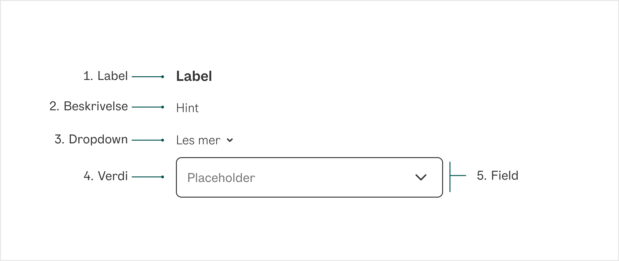
1. Label Tekst som informerer bruker om hva de kan forvente å finne i nedtrekksmenyen

2. Beskrivelse Hjelpetekst som gir bruker kontekst for å ta riktig valg i nedtrekksmenyen

3. Dropdown Ekspanderende felt som supplerer hjelpeteksten. Viktig informasjon skal ikke legges her

4. Verdi Viser valget brukeren har tatt i select-komponenten

5. Field Der brukeren legger inn data.

Divider

Universell utforming

Husk på

  • Alle tekstfelt bør ha et tilknyttet label eller instruksjon som viser hvordan skjemaet skal fylles ut.
  • Label (ledeteksten) bør være koblet til tekstfeltet i koden slik at skjermlesere kan lese opp riktig informasjon. Komplekse skjema kan kreve mer hjelp enn bare enn labels.
  • Feilmeldinger bør være kodet som tekst og identifisere det spesifikke skjemaelementet hvor feilen oppstod. Feilmeldingen må beskrive feilen og være synlig uten at brukeren gjør noen ekstra handlinger.

Sjekkliste

✓ Alle nedtrekksmenyene har tilknyttet label eller instruksjon.

✓ Tydelig, kort og konsis label

Les mer

Ledetekster

WAI-ARIA Select Pattern

Props

Select

PropDescriptionDefault
className?Additional CSS className for the element.-
description?Help text for the form control.-
errorMessage?Error message for the form control. Automatically sets `isInvalid` to true-
label?Label for the form control.-
placeholder?Placeholder text. Only visible when the input value is empty. Temporary text that occupies the text input when it is empty.-
style?Additional style properties for the element.-
isOpen?Sets the open state of the menu.-
defaultOpen?Sets the default open state of the menu.-
onOpenChange?Method that is called when the open state of the menu changes.-
autoFocus?Whether the element should receive focus on render.-
onFocus?Handler that is called when the element receives focus.-
onBlur?Handler that is called when the element loses focus.-
onFocusChange?Handler that is called when the element's focus status changes.-
onKeyDown?Handler that is called when a key is pressed.-
onKeyUp?Handler that is called when a key is released.-
excludeFromTabOrder?Whether to exclude the element from the sequential tab order. If true, the element will not be focusable via the keyboard by tabbing. This should be avoided except in rare scenarios where an alternative means of accessing the element or its functionality via the keyboard is available.-
id?The element's unique identifier. See [MDN](https://developer.mozilla.org/en-US/docs/Web/HTML/Global_attributes/id).-
aria-label?Defines a string value that labels the current element.-
aria-labelledby?Identifies the element (or elements) that labels the current element.-
aria-describedby?Identifies the element (or elements) that describes the object.-
aria-details?Identifies the element (or elements) that provide a detailed, extended description for the object.-
name?The name of the input, used when submitting an HTML form.-
slot?A slot name for the component. Slots allow the component to receive props from a parent component. An explicit `null` value indicates that the local props completely override all props received from a parent.-
validationBehavior?Whether to use native HTML form validation to prevent form submission when the value is missing or invalid, or mark the field as required or invalid via ARIA.'native'
isRequired?Whether user input is required on the input before form submission.-
isInvalid?Whether the input value is invalid.-
validate?A function that returns an error message if a given value is invalid. Validation errors are displayed to the user when the form is submitted if `validationBehavior="native"`. For realtime validation, use the `isInvalid` prop instead.-
onSelectionChange?Handler that is called when the selection changes.-
selectedKey?The currently selected key in the collection (controlled).-
defaultSelectedKey?The initial selected key in the collection (uncontrolled).-
disabledKeys?The item keys that are disabled. These items cannot be selected, focused, or otherwise interacted with.-
autoComplete?Describes the type of autocomplete functionality the input should provide if any. See [MDN](https://developer.mozilla.org/en-US/docs/Web/HTML/Element/input#htmlattrdefautocomplete).-
ref?Allows getting a ref to the component instance. Once the component unmounts, React will set `ref.current` to `null` (or call the ref with `null` if you passed a callback ref). @see {@link https://react.dev/learn/referencing-values-with-refs#refs-and-the-dom React Docs}-
key?-

SelectItem

PropDescriptionDefault
id?The unique id of the item.-
value?The object value that this item represents. When using dynamic collections, this is set automatically.-
textValue?A string representation of the item's contents, used for features like typeahead.-
aria-label?An accessibility label for this item.-
isDisabled?Whether the item is disabled.-
onAction?Handler that is called when a user performs an action on the item. The exact user event depends on the collection's `selectionBehavior` prop and the interaction modality.-
children?The children of the component. A function may be provided to alter the children based on component state.-
className?The CSS [className](https://developer.mozilla.org/en-US/docs/Web/API/Element/className) for the element. A function may be provided to compute the class based on component state.-
style?The inline [style](https://developer.mozilla.org/en-US/docs/Web/API/HTMLElement/style) for the element. A function may be provided to compute the style based on component state.-
href?A URL to link to. See [MDN](https://developer.mozilla.org/en-US/docs/Web/HTML/Element/a#href).-
hrefLang?Hints at the human language of the linked URL. See[MDN](https://developer.mozilla.org/en-US/docs/Web/HTML/Element/a#hreflang).-
target?The target window for the link. See [MDN](https://developer.mozilla.org/en-US/docs/Web/HTML/Element/a#target).-
rel?The relationship between the linked resource and the current page. See [MDN](https://developer.mozilla.org/en-US/docs/Web/HTML/Attributes/rel).-
download?Causes the browser to download the linked URL. A string may be provided to suggest a file name. See [MDN](https://developer.mozilla.org/en-US/docs/Web/HTML/Element/a#download).-
ping?A space-separated list of URLs to ping when the link is followed. See [MDN](https://developer.mozilla.org/en-US/docs/Web/HTML/Element/a#ping).-
referrerPolicy?How much of the referrer to send when following the link. See [MDN](https://developer.mozilla.org/en-US/docs/Web/HTML/Element/a#referrerpolicy).-
routerOptions?Options for the configured client side router.-
onHoverStart?Handler that is called when a hover interaction starts.-
onHoverEnd?Handler that is called when a hover interaction ends.-
onHoverChange?Handler that is called when the hover state changes.-

SelectSection

PropDescriptionDefault
id?The unique id of the section.-
value?The object value that this section represents. When using dynamic collections, this is set automatically.-
children?Static child items or a function to render children.-
dependencies?Values that should invalidate the item cache when using dynamic collections.-
aria-label?An accessibility label for the section.-
items?Item objects in the section.-
className?The CSS [className](https://developer.mozilla.org/en-US/docs/Web/API/Element/className) for the element.-
style?The inline [style](https://developer.mozilla.org/en-US/docs/Web/API/HTMLElement/style) for the element.-

SelectHeader

PropDescriptionDefault
level?-
defaultChecked?-
defaultValue?-
suppressContentEditableWarning?-
suppressHydrationWarning?-
accessKey?-
autoCapitalize?-
autoFocus?-
className?-
contentEditable?-
contextMenu?-
dir?-
draggable?-
enterKeyHint?-
hidden?-
id?-
lang?-
nonce?-
slot?-
spellCheck?-
style?-
tabIndex?-
title?-
translate?-
radioGroup?-
role?-
about?-
content?-
datatype?-
inlist?-
prefix?-
property?-
rel?-
resource?-
rev?-
typeof?-
vocab?-
autoCorrect?-
autoSave?-
color?-
itemProp?-
itemScope?-
itemType?-
itemID?-
itemRef?-
results?-
security?-
unselectable?-
popover?-
popoverTargetAction?-
popoverTarget?-
inert?@see https://developer.mozilla.org/en-US/docs/Web/API/HTMLElement/inert-
inputMode?Hints at the type of data that might be entered by the user while editing the element or its contents @see {@link https://html.spec.whatwg.org/multipage/interaction.html#input-modalities:-the-inputmode-attribute}-
is?Specify that a standard HTML element should behave like a defined custom built-in element @see {@link https://html.spec.whatwg.org/multipage/custom-elements.html#attr-is}-
exportparts?@see {@link https://developer.mozilla.org/en-US/docs/Web/HTML/Global_attributes/exportparts}-
part?@see {@link https://developer.mozilla.org/en-US/docs/Web/HTML/Global_attributes/part}-
aria-activedescendant?Identifies the currently active element when DOM focus is on a composite widget, textbox, group, or application.-
aria-atomic?Indicates whether assistive technologies will present all, or only parts of, the changed region based on the change notifications defined by the aria-relevant attribute.-
aria-autocomplete?Indicates whether inputting text could trigger display of one or more predictions of the user's intended value for an input and specifies how predictions would be presented if they are made.-
aria-braillelabel?Defines a string value that labels the current element, which is intended to be converted into Braille. @see aria-label.-
aria-brailleroledescription?Defines a human-readable, author-localized abbreviated description for the role of an element, which is intended to be converted into Braille. @see aria-roledescription.-
aria-busy?-
aria-checked?Indicates the current "checked" state of checkboxes, radio buttons, and other widgets. @see aria-pressed @see aria-selected.-
aria-colcount?Defines the total number of columns in a table, grid, or treegrid. @see aria-colindex.-
aria-colindex?Defines an element's column index or position with respect to the total number of columns within a table, grid, or treegrid. @see aria-colcount @see aria-colspan.-
aria-colindextext?Defines a human readable text alternative of aria-colindex. @see aria-rowindextext.-
aria-colspan?Defines the number of columns spanned by a cell or gridcell within a table, grid, or treegrid. @see aria-colindex @see aria-rowspan.-
aria-controls?Identifies the element (or elements) whose contents or presence are controlled by the current element. @see aria-owns.-
aria-current?Indicates the element that represents the current item within a container or set of related elements.-
aria-describedby?Identifies the element (or elements) that describes the object. @see aria-labelledby-
aria-description?Defines a string value that describes or annotates the current element. @see related aria-describedby.-
aria-details?Identifies the element that provides a detailed, extended description for the object. @see aria-describedby.-
aria-disabled?Indicates that the element is perceivable but disabled, so it is not editable or otherwise operable. @see aria-hidden @see aria-readonly.-
aria-dropeffect?Indicates what functions can be performed when a dragged object is released on the drop target. @deprecated in ARIA 1.1-
aria-errormessage?Identifies the element that provides an error message for the object. @see aria-invalid @see aria-describedby.-
aria-expanded?Indicates whether the element, or another grouping element it controls, is currently expanded or collapsed.-
aria-flowto?Identifies the next element (or elements) in an alternate reading order of content which, at the user's discretion, allows assistive technology to override the general default of reading in document source order.-
aria-grabbed?Indicates an element's "grabbed" state in a drag-and-drop operation. @deprecated in ARIA 1.1-
aria-haspopup?Indicates the availability and type of interactive popup element, such as menu or dialog, that can be triggered by an element.-
aria-hidden?Indicates whether the element is exposed to an accessibility API. @see aria-disabled.-
aria-invalid?Indicates the entered value does not conform to the format expected by the application. @see aria-errormessage.-
aria-keyshortcuts?Indicates keyboard shortcuts that an author has implemented to activate or give focus to an element.-
aria-label?Defines a string value that labels the current element. @see aria-labelledby.-
aria-labelledby?Identifies the element (or elements) that labels the current element. @see aria-describedby.-
aria-level?Defines the hierarchical level of an element within a structure.-
aria-live?Indicates that an element will be updated, and describes the types of updates the user agents, assistive technologies, and user can expect from the live region.-
aria-modal?Indicates whether an element is modal when displayed.-
aria-multiline?Indicates whether a text box accepts multiple lines of input or only a single line.-
aria-multiselectable?Indicates that the user may select more than one item from the current selectable descendants.-
aria-orientation?Indicates whether the element's orientation is horizontal, vertical, or unknown/ambiguous.-
aria-owns?Identifies an element (or elements) in order to define a visual, functional, or contextual parent/child relationship between DOM elements where the DOM hierarchy cannot be used to represent the relationship. @see aria-controls.-
aria-placeholder?Defines a short hint (a word or short phrase) intended to aid the user with data entry when the control has no value. A hint could be a sample value or a brief description of the expected format.-
aria-posinset?Defines an element's number or position in the current set of listitems or treeitems. Not required if all elements in the set are present in the DOM. @see aria-setsize.-
aria-pressed?Indicates the current "pressed" state of toggle buttons. @see aria-checked @see aria-selected.-
aria-readonly?Indicates that the element is not editable, but is otherwise operable. @see aria-disabled.-
aria-relevant?Indicates what notifications the user agent will trigger when the accessibility tree within a live region is modified. @see aria-atomic.-
aria-required?Indicates that user input is required on the element before a form may be submitted.-
aria-roledescription?Defines a human-readable, author-localized description for the role of an element.-
aria-rowcount?Defines the total number of rows in a table, grid, or treegrid. @see aria-rowindex.-
aria-rowindex?Defines an element's row index or position with respect to the total number of rows within a table, grid, or treegrid. @see aria-rowcount @see aria-rowspan.-
aria-rowindextext?Defines a human readable text alternative of aria-rowindex. @see aria-colindextext.-
aria-rowspan?Defines the number of rows spanned by a cell or gridcell within a table, grid, or treegrid. @see aria-rowindex @see aria-colspan.-
aria-selected?Indicates the current "selected" state of various widgets. @see aria-checked @see aria-pressed.-
aria-setsize?Defines the number of items in the current set of listitems or treeitems. Not required if all elements in the set are present in the DOM. @see aria-posinset.-
aria-sort?Indicates if items in a table or grid are sorted in ascending or descending order.-
aria-valuemax?Defines the maximum allowed value for a range widget.-
aria-valuemin?Defines the minimum allowed value for a range widget.-
aria-valuenow?Defines the current value for a range widget. @see aria-valuetext.-
aria-valuetext?Defines the human readable text alternative of aria-valuenow for a range widget.-
dangerouslySetInnerHTML?-
onCopy?-
onCopyCapture?-
onCut?-
onCutCapture?-
onPaste?-
onPasteCapture?-
onCompositionEnd?-
onCompositionEndCapture?-
onCompositionStart?-
onCompositionStartCapture?-
onCompositionUpdate?-
onCompositionUpdateCapture?-
onFocus?-
onFocusCapture?-
onBlur?-
onBlurCapture?-
onChange?-
onChangeCapture?-
onBeforeInput?-
onBeforeInputCapture?-
onInput?-
onInputCapture?-
onReset?-
onResetCapture?-
onSubmit?-
onSubmitCapture?-
onInvalid?-
onInvalidCapture?-
onLoad?-
onLoadCapture?-
onError?-
onErrorCapture?-
onKeyDown?-
onKeyDownCapture?-
onKeyPress?@deprecated Use `onKeyUp` or `onKeyDown` instead-
onKeyPressCapture?@deprecated Use `onKeyUpCapture` or `onKeyDownCapture` instead-
onKeyUp?-
onKeyUpCapture?-
onAbort?-
onAbortCapture?-
onCanPlay?-
onCanPlayCapture?-
onCanPlayThrough?-
onCanPlayThroughCapture?-
onDurationChange?-
onDurationChangeCapture?-
onEmptied?-
onEmptiedCapture?-
onEncrypted?-
onEncryptedCapture?-
onEnded?-
onEndedCapture?-
onLoadedData?-
onLoadedDataCapture?-
onLoadedMetadata?-
onLoadedMetadataCapture?-
onLoadStart?-
onLoadStartCapture?-
onPause?-
onPauseCapture?-
onPlay?-
onPlayCapture?-
onPlaying?-
onPlayingCapture?-
onProgress?-
onProgressCapture?-
onRateChange?-
onRateChangeCapture?-
onResize?-
onResizeCapture?-
onSeeked?-
onSeekedCapture?-
onSeeking?-
onSeekingCapture?-
onStalled?-
onStalledCapture?-
onSuspend?-
onSuspendCapture?-
onTimeUpdate?-
onTimeUpdateCapture?-
onVolumeChange?-
onVolumeChangeCapture?-
onWaiting?-
onWaitingCapture?-
onAuxClick?-
onAuxClickCapture?-
onClick?-
onClickCapture?-
onContextMenu?-
onContextMenuCapture?-
onDoubleClick?-
onDoubleClickCapture?-
onDrag?-
onDragCapture?-
onDragEnd?-
onDragEndCapture?-
onDragEnter?-
onDragEnterCapture?-
onDragExit?-
onDragExitCapture?-
onDragLeave?-
onDragLeaveCapture?-
onDragOver?-
onDragOverCapture?-
onDragStart?-
onDragStartCapture?-
onDrop?-
onDropCapture?-
onMouseDown?-
onMouseDownCapture?-
onMouseEnter?-
onMouseLeave?-
onMouseMove?-
onMouseMoveCapture?-
onMouseOut?-
onMouseOutCapture?-
onMouseOver?-
onMouseOverCapture?-
onMouseUp?-
onMouseUpCapture?-
onSelect?-
onSelectCapture?-
onTouchCancel?-
onTouchCancelCapture?-
onTouchEnd?-
onTouchEndCapture?-
onTouchMove?-
onTouchMoveCapture?-
onTouchStart?-
onTouchStartCapture?-
onPointerDown?-
onPointerDownCapture?-
onPointerMove?-
onPointerMoveCapture?-
onPointerUp?-
onPointerUpCapture?-
onPointerCancel?-
onPointerCancelCapture?-
onPointerEnter?-
onPointerLeave?-
onPointerOver?-
onPointerOverCapture?-
onPointerOut?-
onPointerOutCapture?-
onGotPointerCapture?-
onGotPointerCaptureCapture?-
onLostPointerCapture?-
onLostPointerCaptureCapture?-
onScroll?-
onScrollCapture?-
onScrollEnd?-
onScrollEndCapture?-
onWheel?-
onWheelCapture?-
onAnimationStart?-
onAnimationStartCapture?-
onAnimationEnd?-
onAnimationEndCapture?-
onAnimationIteration?-
onAnimationIterationCapture?-
onToggle?-
onBeforeToggle?-
onTransitionCancel?-
onTransitionCancelCapture?-
onTransitionEnd?-
onTransitionEndCapture?-
onTransitionRun?-
onTransitionRunCapture?-
onTransitionStart?-
onTransitionStartCapture?-