
RadioGroup
Om komponenten
RadioGroup lar brukeren enkelt skanne og sammenligne alternativer for å ta ett valg.
Egnet til:
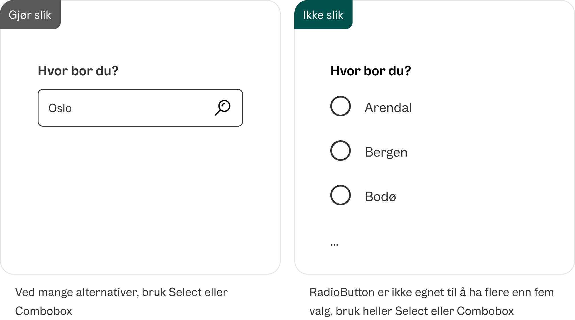
- Handlinger der brukeren skal velge kun ett alternativ fra en liste på fem eller færre.
Uegnet til:
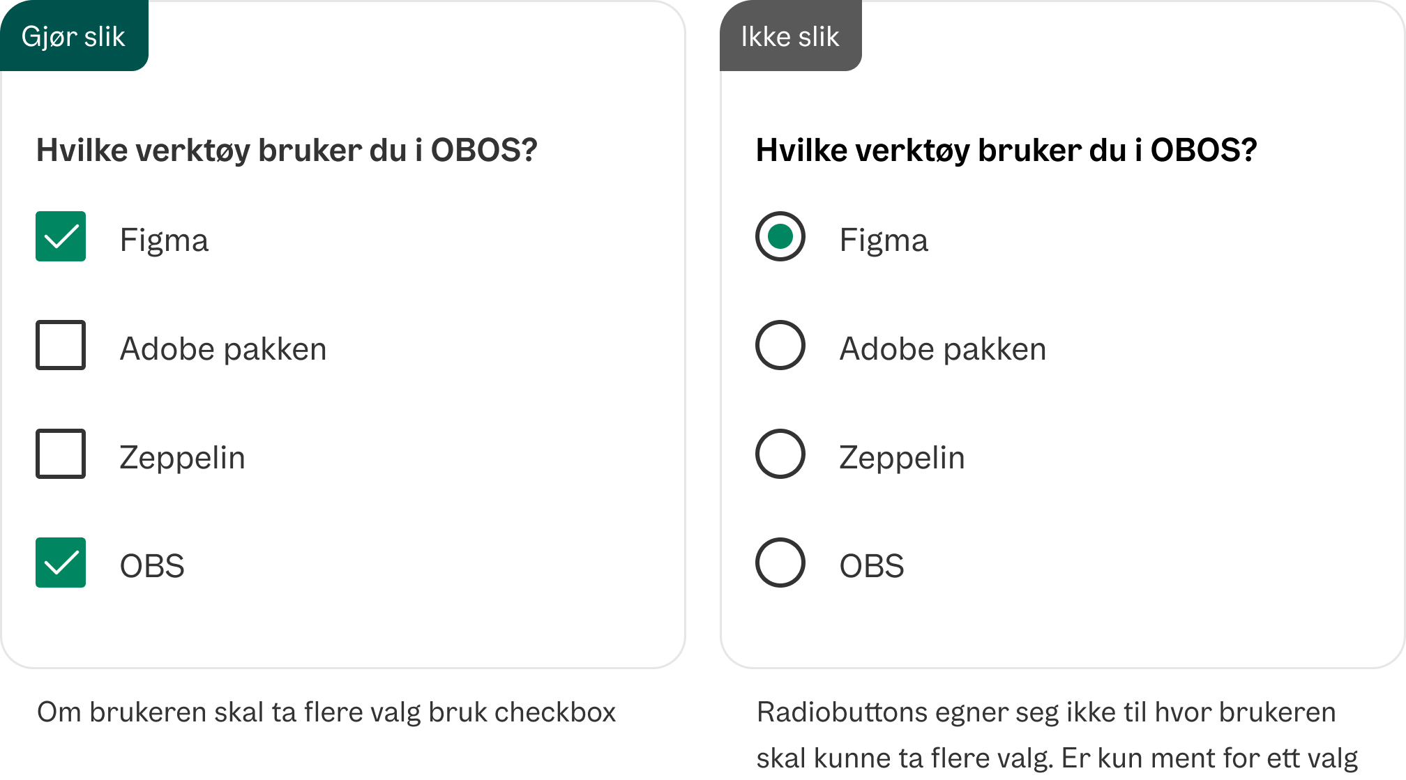
- Der bruker kan krysse av og på for ett alternativ, eller der flere valg i listen er tillatt. Se Checkbox eller Select.

Varianter
Uncontrolled
En uncontrolled RadioGroup med tre valg.
<RadioGroup>
  <Radio value="ordinary">Ordinær pris</Radio>
  <Radio
    value="bostart"
    description="OBOS Bostart gjør at du kan kjøpe en helt ny bolig til en lavere pris enn ordinær markedspris."
  >
    OBOS Bostart
  </Radio>
  <Radio
    value="deleie"
    description="Med OBOS Deleie kan du kjøpe halve boligen, eller mer, og bo i hele."
  >
    OBOS Deleie
  </Radio>
</RadioGroup>
En uncontrolled RadioGroup med default valg.
<RadioGroup
  defaultValue="deleie"
>
  <Radio value="ordinary">Ordinær pris</Radio>
  <Radio
    value="bostart"
    description="OBOS Bostart gjør at du kan kjøpe en helt ny bolig til en lavere pris enn ordinær markedspris."
  >
    OBOS Bostart
  </Radio>
  <Radio
    value="deleie"
    description="Med OBOS Deleie kan du kjøpe halve boligen, eller mer, og bo i hele."
  >
    OBOS Deleie
  </Radio>
</RadioGroup>
En uncontrolled RadioGroup med beskrivelse.
<RadioGroup
  description="Kontakt oss for mer utfyllende informasjon om de forskjellige alternativene"
>
  <Radio value="ordinary">Ordinær pris</Radio>
  <Radio
    value="bostart"
    description="OBOS Bostart gjør at du kan kjøpe en helt ny bolig til en lavere pris enn ordinær markedspris."
  >
    OBOS Bostart
  </Radio>
  <Radio
    value="deleie"
    description="Med OBOS Deleie kan du kjøpe halve boligen, eller mer, og bo i hele."
  >
    OBOS Deleie
  </Radio>
</RadioGroup>
Validering
En påkrevd RadioGroup.
<form
  onSubmit={(e) => e.preventDefault()}
  className="grid gap-6"
>
   <RadioGroup isRequired>
    <Radio value="ordinary">Ordinær pris</Radio>
    <Radio
      value="bostart"
      description="OBOS Bostart gjør at du kan kjøpe en helt ny bolig til en lavere pris enn ordinær markedspris."
    >
      OBOS Bostart
    </Radio>
    <Radio
      value="deleie"
      description="Med OBOS Deleie kan du kjøpe halve boligen, eller mer, og bo i hele."
    >
      OBOS Deleie
    </Radio>
  </RadioGroup>
  <Button type="submit" className="w-fit">Send inn</Button>
</form>
En invalid RadioGroup.
<RadioGroup
  isInvalid
>
  <Radio value="ordinary">Ordinær pris</Radio>
  <Radio
    value="bostart"
    description="OBOS Bostart gjør at du kan kjøpe en helt ny bolig til en lavere pris enn ordinær markedspris."
  >
    OBOS Bostart
  </Radio>
  <Radio
    value="deleie"
    description="Med OBOS Deleie kan du kjøpe halve boligen, eller mer, og bo i hele."
  >
    OBOS Deleie
  </Radio>
</RadioGroup>
Controlled
En controlled CheckboxGroup
function(){
  const [value, setValue] = React.useState('deleie');

return <RadioGroup
  label="Jeg er interessert i"
  value={value}
  onChange={(newValue) => setValue(newValue)}
>
  <Radio value="ordinary">Ordinær pris</Radio>
  <Radio
    value="bostart"
    description="OBOS Bostart gjør at du kan kjøpe en helt ny bolig til en lavere pris enn ordinær markedspris."
  >
    OBOS Bostart
  </Radio>
  <Radio
    value="deleie"
    description="Med OBOS Deleie kan du kjøpe halve boligen, eller mer, og bo i hele."
  >
    OBOS Deleie
  </Radio>
</CheckboxGroup>}
Retningslinjer
Ikke bruk radioknapper om brukeren skal kunne velge flere valg
Ikke bruk RadioButton dersom du har mange valg
Formatering
Anatomi
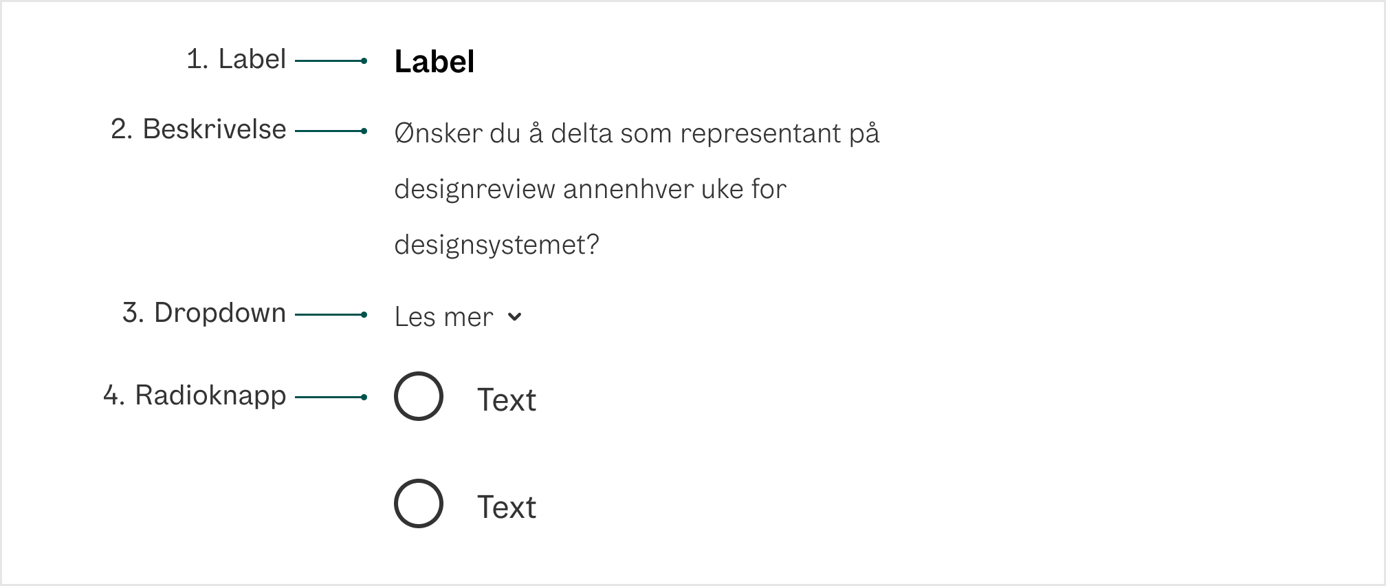
1. Label Forteller brukeren hva som skal velges
2. Beskrivelse (valgfri) Hjelpetekst med mer informasjon eller gir kontekst til brukeren.
3. Dropdown (valgfri) Ekspanderende felt som skal supplere hjelpeteksten med mer informasjon. Viktig informasjon skal ikke legges her.
4. RadioButton En radioknapp som indikerer riktig tilstand. Som standard er det ikke valgt.
Universell utforming
Husk på
- Alle radioknappene må ha klare, konsise og unike labels. WCAG 1.3.1 og 2.4.6
- Unngå standardvalg: Forhåndsvalgte valg anses som en villedende praksis for alle brukere. Gå for at brukeren selv skal kunne ta et aktivt valg når du bruker radioknapper.
- Alle tastaturinteraksjoner og ARIA-etiketter må oppfylle tilgjengelighetskriterier (WAI-ARIA Checkbox Authoring Practices - Gjelder også for Radiobuttons)
Sjekkliste
✓ Alle radioknappene har en klar, kortfattet og unik label
✓ Ingen av radioknappene har et satt standardvalg
✓ Brukeren kan tabbe seg gjennom radioknappene, og velge en av dem ved å trykke space
Les mer
WCAG 1.3.1 Info and Relationships (A)
Props
RadioGroup
| Prop | Description | Default |
|---|---|---|
description? | Help text for the form control. | - |
errorMessage? | Error message for the form control. Automatically sets isInvalid to true | - |
label? | Label for the form control. | - |
form? | - | |
defaultValue? | The default value (uncontrolled). | - |
name? | - | |
value? | The current value (controlled). | - |
render? | - | |
isRequired? | Whether user input is required on the input before form submission. | - |
isInvalid? | Whether the input value is invalid. | - |
validationBehavior? | Whether to use native HTML form validation to prevent form submission when the value is missing or invalid, or mark the field as required or invalid via ARIA. | 'native' |
validate? | A function that returns an error message if a given value is invalid.
Validation errors are displayed to the user when the form is submitted
if validationBehavior="native". For realtime validation, use the isInvalid
prop instead. | - |
| Events | ||
onFocus? | Handler that is called when the element receives focus. | - |
onBlur? | Handler that is called when the element loses focus. | - |
onChange? | Handler that is called when the value changes. | - |
onFocusChange? | Handler that is called when the element's focus status changes. | - |
| Styles | ||
className? | Additional CSS className for the element. | - |
style? | Additional style properties for the element. | - |
| Accessibility | ||
id? | - | |
aria-describedby? | - | |
aria-details? | - | |
aria-errormessage? | - | |
aria-label? | - | |
aria-labelledby? | - | |
Radio
| Prop | Description | Default |
|---|---|---|
description? | Help text for the form control. | - |
autoFocus? | - | |
value | The value of the radio button, used when submitting an HTML form. See MDN. | - |
render? | - | |
inputRef? | A ref for the HTML input element. | - |
| Events | ||
onFocus? | Handler that is called when the element receives focus. | - |
onBlur? | Handler that is called when the element loses focus. | - |
onKeyDown? | Handler that is called when a key is pressed. | - |
onKeyUp? | Handler that is called when a key is released. | - |
onClick? | Not recommended – use onPress instead. onClick is an alias for onPress
provided for compatibility with other libraries. onPress provides
additional event details for non-mouse interactions. | - |
onPress? | Handler that is called when the press is released over the target. | - |
onPressStart? | Handler that is called when a press interaction starts. | - |
onPressEnd? | Handler that is called when a press interaction ends, either over the target or when the pointer leaves the target. | - |
onPressChange? | Handler that is called when the press state changes. | - |
onPressUp? | Handler that is called when a press is released over the target, regardless of whether it started on the target or not. | - |
onFocusChange? | Handler that is called when the element's focus status changes. | - |
onHoverStart? | Handler that is called when a hover interaction starts. | - |
onHoverEnd? | Handler that is called when a hover interaction ends. | - |
onHoverChange? | Handler that is called when the hover state changes. | - |
| Styles | ||
className? | Additional CSS className for the element. The CSS className for the element. A function may be provided to compute the class based on component state. | 'react-aria-Radio' |
style? | Additional style properties for the element. | - |
| Accessibility | ||
id? | - | |
aria-describedby? | - | |
aria-details? | - | |
aria-label? | - | |
aria-labelledby? | - | |