Accordion

Om komponenten

Accordion lar brukeren vise og skjule innhold i ulike seksjoner ved å klikke på overskriftene.

Egnet til:

  • Å strukturere store mengder informasjon, som for eksempel i en FAQ.
  • Å forkorte sider og redusere unødvendig scrolling når innholdet ikke må leses i i sin helhet, eller når plassen er begrenset, som på et mobilgrensesnitt.

Uegnet til:

  • Annen vilkårlig funksjonalitet der innhold skal kunne skjules og vises. Bruk heller Disclosure til dette
  • Viktig informasjon som bruker enkelt må finne.
  • Små mengder informasjon.

Divider

Varianter

<Accordion>
  <AccordionItem>
    <Heading level={2}>
      Hvordan betaler jeg ned på rammelånet?
    </Heading>
    <Content className="prose">
      Den største forskjellen mellom et vanlig boliglån og et rammelån er fleksibiliteten. Med et rammelån kan du velge å betale mindre ned på lånet i trangere tider, hvis du for eksempel i en periode opplever å få andre uforutsette utgifter. Med et rammelån kan det friste å bruke mer penger enn det du egentlig har behov for. Derfor er det viktig at du har god økonomisk disiplin, og vi anbefaler alltid å sette opp et fast månedlig trekk som minimum dekker dekker rentene. Du kan når som helst betale ned på rammelånet ditt. Det gjør du enkelt i mobilbanken eller nettbanken ved å overføre beløpet du ønsker fra en konto og inn til rammelånet.
    </Content>
  </AccordionItem>
  <AccordionItem>
    <Heading level={2}>
      Bør jeg velge rammelån eller boliglån?
    </Heading>
    <Content className="prose">
      <p>
        Om du bør velge rammelån eller boliglån avhenger av den økonomiske situasjonen din, preferansene dine og hvor mye fleksibilitet du ønsker knyttet til nedbetaling av lånet.
      </p>
      <p>
        De viktigste forskjellene på rammelån og boliglån som du bør være klar over før du tar et valg:
      </p>
      <ul>
        <li>
          Fleksibilitet: Rammelån gir deg større fleksibilitet til å låne og betale tilbake penger etter behov, mens et vanlig boliglån har en fast nedbetalingsplan.
        </li>
        <li>
          Nedbetaling av lånet: Et vanlig boliglån har en fastsatt nedbetalingsplan, mens rammelånet gir deg mer frihet til å velge når og hvor mye du ønsker å betale tilbake.
        </li>
        <li>
          Beregning av renter: Med et rammelån betaler du renter bare på det beløpet du faktisk har brukt, mens med et vanlig boliglån baserer renter seg på hele lånebeløpet.
        </li>
      </ul>
    </Content>
  </AccordionItem>
  <AccordionItem>
    <Heading level={2}>
      Overfør penger fra Boligspar Ung?
    </Heading>
    <Content className="prose">
      <p>
        Ønsker du å overføre penger fra Boligspar Ung til en av dine andre kontoer, er det en enkel sak.{' '}
        <a href="#">
          Logg inn i nettbanken
        </a>
        {' '}og velg "Uttak Boligspar" Ung i menyen. Slik som BSU, kan du ta ut det du har spart inneværende år. Om du vil ta ut mer vil kontoen avsluttes.
      </p>
    </Content>
  </AccordionItem>
</Accordion>
Divider

Retningslinjer

Innholdet i en Accordion bør ha en relasjon til hverandre. Det gjør det lettere for bruker å finne fram til relevant informasjon, og enklere for redaktør å skille innhold fra hverandre.

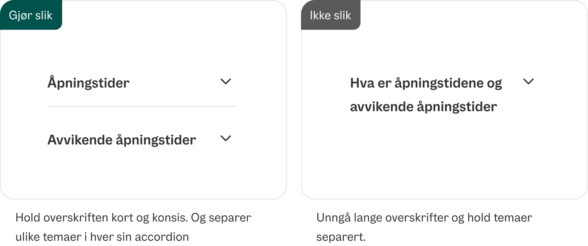
Dersom det er flere temaer, så bryt opp med flere seksjoner for å sikre at man ikke får for lange tekster, eller at innholdet ikke oppleves som relevant for overskriften.

Innhold liggende i en Accordion har lett for å bli oversett. Pass derfor på at innhold avgjørende for bruker ikke ligger gjemt.

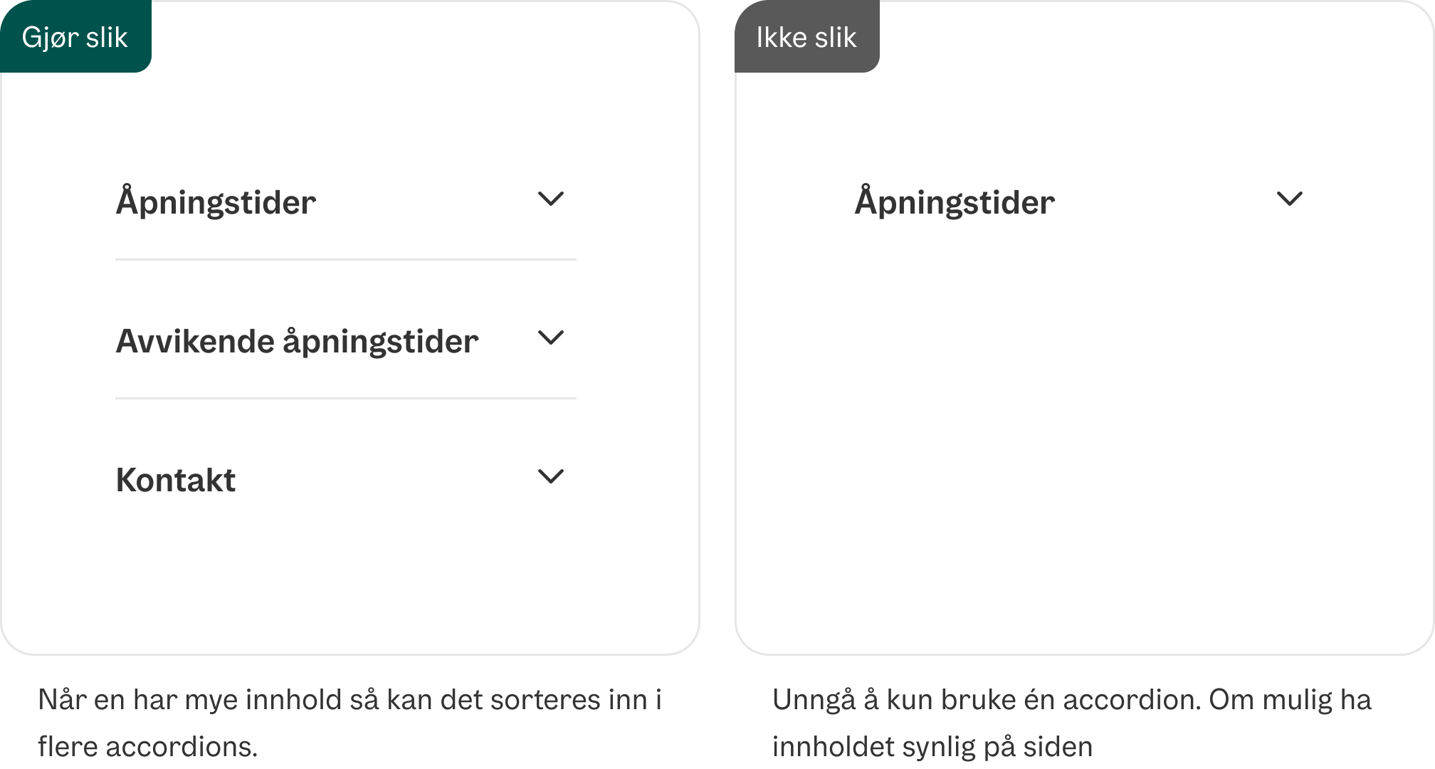
Dersom det er mye informasjon som skal fortelles, så vurder å heller lage en egen side fremfor å gjemme det i en Accordion.

Unngå å kun bruke én accordion

Unngå én accordion

Unngå lange overskrifter med flere temaer

Unngå lange overskrifter med flere temaer

Divider

Formatering

Anatomi

Accordion-komponentens anatomi med header, ikon og panel

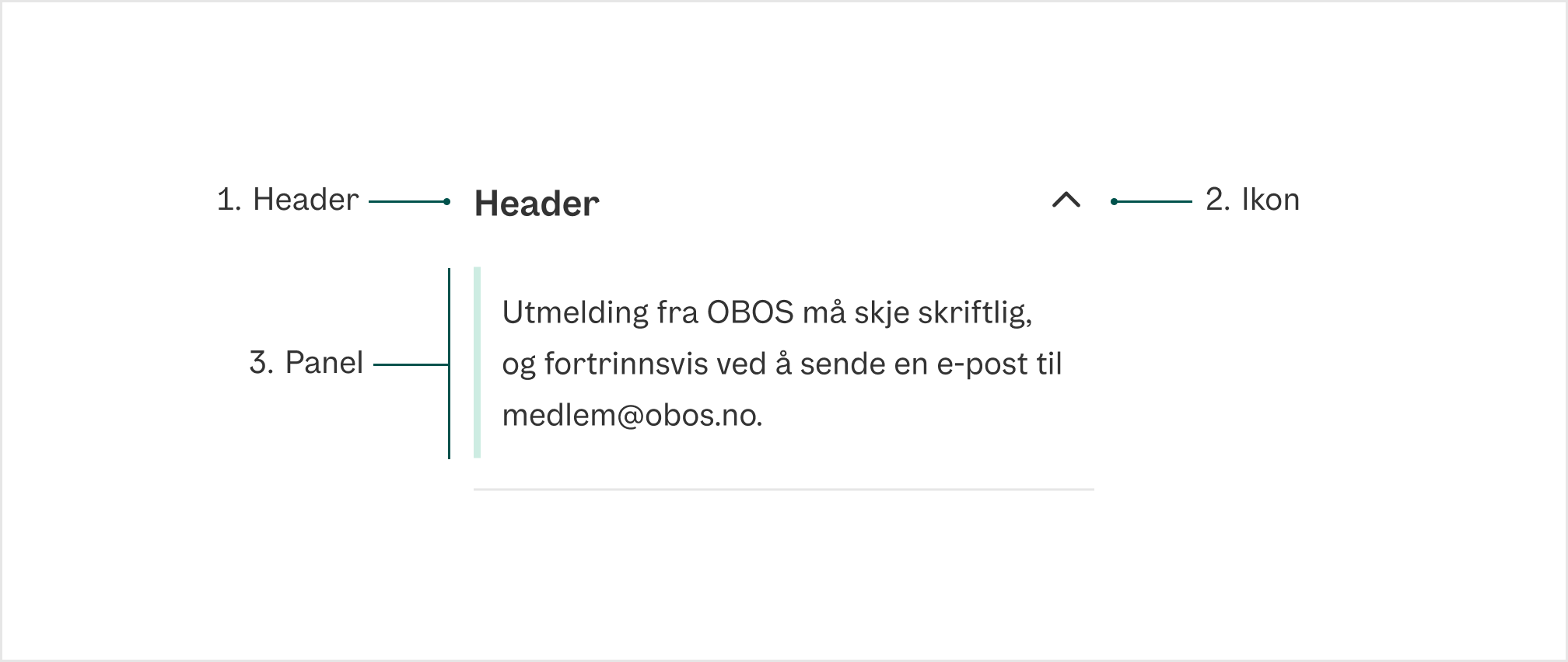
  1. Header Overskriften i accordion, hold denne kort og konsis
  2. Ikon Viser om Accordion er åpen eller lukket
  3. Panel Der innholdet knyttet til headeren ligger
Divider

Universell utforming

Husk på

  • Ved tastaturnavgiering, skal man kunne bruke Tab og Shift + Tab for å navigere mellom accordionradene.
  • Ved tastaturnavigering, skal man kunne åpne og lukke en accordionrad ved å trykke Enter eller Space.
  • Ved tastaturnavigering, skal fokus flyttes og markeres med god kontrast og passende stilendringer.
  • Ved valgt/åpnet accordionrad, skal raden markeres tydelig.

Sjekkliste

✓ Kort og konsis overskrift i Accordion
✓ Overordnet overskrift har samme id som i ariaLabelledBy-prop i Accordion

Les mer

WAI-ARIA Accordion pattern

WCAG 1.3.1 Info and Relationships (A)

WCAG 3.2.4 Consistant Identification (AA)

Props

Accordion

PropDescriptionDefault
accept?-
acceptCharset?-
action?-
allowFullScreen?-
allowTransparency?-
alt?-
as?-
async?-
autoComplete?-
autoPlay?-
capture?-
cellPadding?-
cellSpacing?-
charSet?-
challenge?-
checked?-
cite?-
classID?-
cols?-
colSpan?-
controls?-
coords?-
crossOrigin?-
data?-
dateTime?-
default?-
defer?-
disabled?-
download?-
encType?-
form?-
formAction?-
formEncType?-
formMethod?-
formNoValidate?-
formTarget?-
frameBorder?-
headers?-
height?-
high?-
href?-
hrefLang?-
htmlFor?-
httpEquiv?-
integrity?-
keyParams?-
keyType?-
kind?-
label?-
list?-
loop?-
low?-
manifest?-
marginHeight?-
marginWidth?-
max?-
maxLength?-
media?-
mediaGroup?-
method?-
min?-
minLength?-
multiple?-
muted?-
name?-
noValidate?-
open?-
optimum?-
pattern?-
placeholder?-
playsInline?-
poster?-
preload?-
readOnly?-
required?-
reversed?-
rows?-
rowSpan?-
sandbox?-
scope?-
scoped?-
scrolling?-
seamless?-
selected?-
shape?-
size?-
sizes?-
span?-
src?-
srcDoc?-
srcLang?-
srcSet?-
start?-
step?-
summary?-
target?-
type?-
useMap?-
value?-
width?-
wmode?-
wrap?-
defaultChecked?-
defaultValue?-
suppressContentEditableWarning?-
suppressHydrationWarning?-
accessKey?-
autoCapitalize?-
autoFocus?-
className?-
contentEditable?-
contextMenu?-
dir?-
draggable?-
enterKeyHint?-
hidden?-
id?-
lang?-
nonce?-
slot?-
spellCheck?-
style?-
tabIndex?-
title?-
translate?-
radioGroup?-
role?-
about?-
content?-
datatype?-
inlist?-
prefix?-
property?-
rel?-
resource?-
rev?-
typeof?-
vocab?-
autoCorrect?-
autoSave?-
color?-
itemProp?-
itemScope?-
itemType?-
itemID?-
itemRef?-
results?-
security?-
unselectable?-
popover?-
popoverTargetAction?-
popoverTarget?-
inert?@see https://developer.mozilla.org/en-US/docs/Web/API/HTMLElement/inert-
inputMode?Hints at the type of data that might be entered by the user while editing the element or its contents @see {@link https://html.spec.whatwg.org/multipage/interaction.html#input-modalities:-the-inputmode-attribute}-
is?Specify that a standard HTML element should behave like a defined custom built-in element @see {@link https://html.spec.whatwg.org/multipage/custom-elements.html#attr-is}-
exportparts?@see {@link https://developer.mozilla.org/en-US/docs/Web/HTML/Global_attributes/exportparts}-
part?@see {@link https://developer.mozilla.org/en-US/docs/Web/HTML/Global_attributes/part}-
aria-activedescendant?Identifies the currently active element when DOM focus is on a composite widget, textbox, group, or application.-
aria-atomic?Indicates whether assistive technologies will present all, or only parts of, the changed region based on the change notifications defined by the aria-relevant attribute.-
aria-autocomplete?Indicates whether inputting text could trigger display of one or more predictions of the user's intended value for an input and specifies how predictions would be presented if they are made.-
aria-braillelabel?Defines a string value that labels the current element, which is intended to be converted into Braille. @see aria-label.-
aria-brailleroledescription?Defines a human-readable, author-localized abbreviated description for the role of an element, which is intended to be converted into Braille. @see aria-roledescription.-
aria-busy?-
aria-checked?Indicates the current "checked" state of checkboxes, radio buttons, and other widgets. @see aria-pressed @see aria-selected.-
aria-colcount?Defines the total number of columns in a table, grid, or treegrid. @see aria-colindex.-
aria-colindex?Defines an element's column index or position with respect to the total number of columns within a table, grid, or treegrid. @see aria-colcount @see aria-colspan.-
aria-colindextext?Defines a human readable text alternative of aria-colindex. @see aria-rowindextext.-
aria-colspan?Defines the number of columns spanned by a cell or gridcell within a table, grid, or treegrid. @see aria-colindex @see aria-rowspan.-
aria-controls?Identifies the element (or elements) whose contents or presence are controlled by the current element. @see aria-owns.-
aria-current?Indicates the element that represents the current item within a container or set of related elements.-
aria-describedby?Identifies the element (or elements) that describes the object. @see aria-labelledby-
aria-description?Defines a string value that describes or annotates the current element. @see related aria-describedby.-
aria-details?Identifies the element that provides a detailed, extended description for the object. @see aria-describedby.-
aria-disabled?Indicates that the element is perceivable but disabled, so it is not editable or otherwise operable. @see aria-hidden @see aria-readonly.-
aria-dropeffect?Indicates what functions can be performed when a dragged object is released on the drop target. @deprecated in ARIA 1.1-
aria-errormessage?Identifies the element that provides an error message for the object. @see aria-invalid @see aria-describedby.-
aria-expanded?Indicates whether the element, or another grouping element it controls, is currently expanded or collapsed.-
aria-flowto?Identifies the next element (or elements) in an alternate reading order of content which, at the user's discretion, allows assistive technology to override the general default of reading in document source order.-
aria-grabbed?Indicates an element's "grabbed" state in a drag-and-drop operation. @deprecated in ARIA 1.1-
aria-haspopup?Indicates the availability and type of interactive popup element, such as menu or dialog, that can be triggered by an element.-
aria-hidden?Indicates whether the element is exposed to an accessibility API. @see aria-disabled.-
aria-invalid?Indicates the entered value does not conform to the format expected by the application. @see aria-errormessage.-
aria-keyshortcuts?Indicates keyboard shortcuts that an author has implemented to activate or give focus to an element.-
aria-label?Defines a string value that labels the current element. @see aria-labelledby.-
aria-labelledby?Identifies the element (or elements) that labels the current element. @see aria-describedby.-
aria-level?Defines the hierarchical level of an element within a structure.-
aria-live?Indicates that an element will be updated, and describes the types of updates the user agents, assistive technologies, and user can expect from the live region.-
aria-modal?Indicates whether an element is modal when displayed.-
aria-multiline?Indicates whether a text box accepts multiple lines of input or only a single line.-
aria-multiselectable?Indicates that the user may select more than one item from the current selectable descendants.-
aria-orientation?Indicates whether the element's orientation is horizontal, vertical, or unknown/ambiguous.-
aria-owns?Identifies an element (or elements) in order to define a visual, functional, or contextual parent/child relationship between DOM elements where the DOM hierarchy cannot be used to represent the relationship. @see aria-controls.-
aria-placeholder?Defines a short hint (a word or short phrase) intended to aid the user with data entry when the control has no value. A hint could be a sample value or a brief description of the expected format.-
aria-posinset?Defines an element's number or position in the current set of listitems or treeitems. Not required if all elements in the set are present in the DOM. @see aria-setsize.-
aria-pressed?Indicates the current "pressed" state of toggle buttons. @see aria-checked @see aria-selected.-
aria-readonly?Indicates that the element is not editable, but is otherwise operable. @see aria-disabled.-
aria-relevant?Indicates what notifications the user agent will trigger when the accessibility tree within a live region is modified. @see aria-atomic.-
aria-required?Indicates that user input is required on the element before a form may be submitted.-
aria-roledescription?Defines a human-readable, author-localized description for the role of an element.-
aria-rowcount?Defines the total number of rows in a table, grid, or treegrid. @see aria-rowindex.-
aria-rowindex?Defines an element's row index or position with respect to the total number of rows within a table, grid, or treegrid. @see aria-rowcount @see aria-rowspan.-
aria-rowindextext?Defines a human readable text alternative of aria-rowindex. @see aria-colindextext.-
aria-rowspan?Defines the number of rows spanned by a cell or gridcell within a table, grid, or treegrid. @see aria-rowindex @see aria-colspan.-
aria-selected?Indicates the current "selected" state of various widgets. @see aria-checked @see aria-pressed.-
aria-setsize?Defines the number of items in the current set of listitems or treeitems. Not required if all elements in the set are present in the DOM. @see aria-posinset.-
aria-sort?Indicates if items in a table or grid are sorted in ascending or descending order.-
aria-valuemax?Defines the maximum allowed value for a range widget.-
aria-valuemin?Defines the minimum allowed value for a range widget.-
aria-valuenow?Defines the current value for a range widget. @see aria-valuetext.-
aria-valuetext?Defines the human readable text alternative of aria-valuenow for a range widget.-
dangerouslySetInnerHTML?-
onCopy?-
onCopyCapture?-
onCut?-
onCutCapture?-
onPaste?-
onPasteCapture?-
onCompositionEnd?-
onCompositionEndCapture?-
onCompositionStart?-
onCompositionStartCapture?-
onCompositionUpdate?-
onCompositionUpdateCapture?-
onFocus?-
onFocusCapture?-
onBlur?-
onBlurCapture?-
onChange?-
onChangeCapture?-
onBeforeInput?-
onBeforeInputCapture?-
onInput?-
onInputCapture?-
onReset?-
onResetCapture?-
onSubmit?-
onSubmitCapture?-
onInvalid?-
onInvalidCapture?-
onLoad?-
onLoadCapture?-
onError?-
onErrorCapture?-
onKeyDown?-
onKeyDownCapture?-
onKeyPress?@deprecated Use `onKeyUp` or `onKeyDown` instead-
onKeyPressCapture?@deprecated Use `onKeyUpCapture` or `onKeyDownCapture` instead-
onKeyUp?-
onKeyUpCapture?-
onAbort?-
onAbortCapture?-
onCanPlay?-
onCanPlayCapture?-
onCanPlayThrough?-
onCanPlayThroughCapture?-
onDurationChange?-
onDurationChangeCapture?-
onEmptied?-
onEmptiedCapture?-
onEncrypted?-
onEncryptedCapture?-
onEnded?-
onEndedCapture?-
onLoadedData?-
onLoadedDataCapture?-
onLoadedMetadata?-
onLoadedMetadataCapture?-
onLoadStart?-
onLoadStartCapture?-
onPause?-
onPauseCapture?-
onPlay?-
onPlayCapture?-
onPlaying?-
onPlayingCapture?-
onProgress?-
onProgressCapture?-
onRateChange?-
onRateChangeCapture?-
onSeeked?-
onSeekedCapture?-
onSeeking?-
onSeekingCapture?-
onStalled?-
onStalledCapture?-
onSuspend?-
onSuspendCapture?-
onTimeUpdate?-
onTimeUpdateCapture?-
onVolumeChange?-
onVolumeChangeCapture?-
onWaiting?-
onWaitingCapture?-
onAuxClick?-
onAuxClickCapture?-
onClick?-
onClickCapture?-
onContextMenu?-
onContextMenuCapture?-
onDoubleClick?-
onDoubleClickCapture?-
onDrag?-
onDragCapture?-
onDragEnd?-
onDragEndCapture?-
onDragEnter?-
onDragEnterCapture?-
onDragExit?-
onDragExitCapture?-
onDragLeave?-
onDragLeaveCapture?-
onDragOver?-
onDragOverCapture?-
onDragStart?-
onDragStartCapture?-
onDrop?-
onDropCapture?-
onMouseDown?-
onMouseDownCapture?-
onMouseEnter?-
onMouseLeave?-
onMouseMove?-
onMouseMoveCapture?-
onMouseOut?-
onMouseOutCapture?-
onMouseOver?-
onMouseOverCapture?-
onMouseUp?-
onMouseUpCapture?-
onSelect?-
onSelectCapture?-
onTouchCancel?-
onTouchCancelCapture?-
onTouchEnd?-
onTouchEndCapture?-
onTouchMove?-
onTouchMoveCapture?-
onTouchStart?-
onTouchStartCapture?-
onPointerDown?-
onPointerDownCapture?-
onPointerMove?-
onPointerMoveCapture?-
onPointerUp?-
onPointerUpCapture?-
onPointerCancel?-
onPointerCancelCapture?-
onPointerEnter?-
onPointerLeave?-
onPointerOver?-
onPointerOverCapture?-
onPointerOut?-
onPointerOutCapture?-
onGotPointerCapture?-
onGotPointerCaptureCapture?-
onLostPointerCapture?-
onLostPointerCaptureCapture?-
onScroll?-
onScrollCapture?-
onScrollEnd?-
onScrollEndCapture?-
onWheel?-
onWheelCapture?-
onAnimationStart?-
onAnimationStartCapture?-
onAnimationEnd?-
onAnimationEndCapture?-
onAnimationIteration?-
onAnimationIterationCapture?-
onToggle?-
onBeforeToggle?-
onTransitionCancel?-
onTransitionCancelCapture?-
onTransitionEnd?-
onTransitionEndCapture?-
onTransitionRun?-
onTransitionRunCapture?-
onTransitionStart?-
onTransitionStartCapture?-
ref?Allows getting a ref to the component instance. Once the component unmounts, React will set `ref.current` to `null` (or call the ref with `null` if you passed a callback ref). @see {@link https://react.dev/learn/referencing-values-with-refs#refs-and-the-dom React Docs}-
key?-

AccordionItem

PropDescriptionDefault
id?An id for the disclosure when used within a DisclosureGroup, matching the id used in `expandedKeys`.-
isDisabled?Whether the disclosure is disabled.-
onExpandedChange?Handler that is called when the disclosure's expanded state changes.-
isExpanded?Whether the disclosure is expanded (controlled).-
defaultExpanded?Whether the disclosure is expanded by default (uncontrolled).-
children?The children of the component.-
className?The CSS [className](https://developer.mozilla.org/en-US/docs/Web/API/Element/className) for the element.-
style?The inline [style](https://developer.mozilla.org/en-US/docs/Web/API/HTMLElement/style) for the element.-
slot?A slot name for the component. Slots allow the component to receive props from a parent component. An explicit `null` value indicates that the local props completely override all props received from a parent.-
dir?-
lang?-
hidden?-
inert?-
translate?-
onClick?-
onClickCapture?-
onAuxClick?-
onAuxClickCapture?-
onContextMenu?-
onContextMenuCapture?-
onDoubleClick?-
onDoubleClickCapture?-
onMouseDown?-
onMouseDownCapture?-
onMouseEnter?-
onMouseLeave?-
onMouseMove?-
onMouseMoveCapture?-
onMouseOut?-
onMouseOutCapture?-
onMouseOver?-
onMouseOverCapture?-
onMouseUp?-
onMouseUpCapture?-
onTouchCancel?-
onTouchCancelCapture?-
onTouchEnd?-
onTouchEndCapture?-
onTouchMove?-
onTouchMoveCapture?-
onTouchStart?-
onTouchStartCapture?-
onPointerDown?-
onPointerDownCapture?-
onPointerMove?-
onPointerMoveCapture?-
onPointerUp?-
onPointerUpCapture?-
onPointerCancel?-
onPointerCancelCapture?-
onPointerEnter?-
onPointerLeave?-
onPointerOver?-
onPointerOverCapture?-
onPointerOut?-
onPointerOutCapture?-
onGotPointerCapture?-
onGotPointerCaptureCapture?-
onLostPointerCapture?-
onLostPointerCaptureCapture?-
onScroll?-
onScrollCapture?-
onWheel?-
onWheelCapture?-
onAnimationStart?-
onAnimationStartCapture?-
onAnimationEnd?-
onAnimationEndCapture?-
onAnimationIteration?-
onAnimationIterationCapture?-
onTransitionCancel?-
onTransitionCancelCapture?-
onTransitionEnd?-
onTransitionEndCapture?-
onTransitionRun?-
onTransitionRunCapture?-
onTransitionStart?-
onTransitionStartCapture?-
ref?Allows getting a ref to the component instance. Once the component unmounts, React will set `ref.current` to `null` (or call the ref with `null` if you passed a callback ref). @see {@link https://react.dev/learn/referencing-values-with-refs#refs-and-the-dom React Docs}-
key?-
isOpen?@deprecated use isExpanded instead-
defaultOpen?@deprecated use defaultExpanded instead-
onOpenChange?@deprecated use onExpandedChange instead-